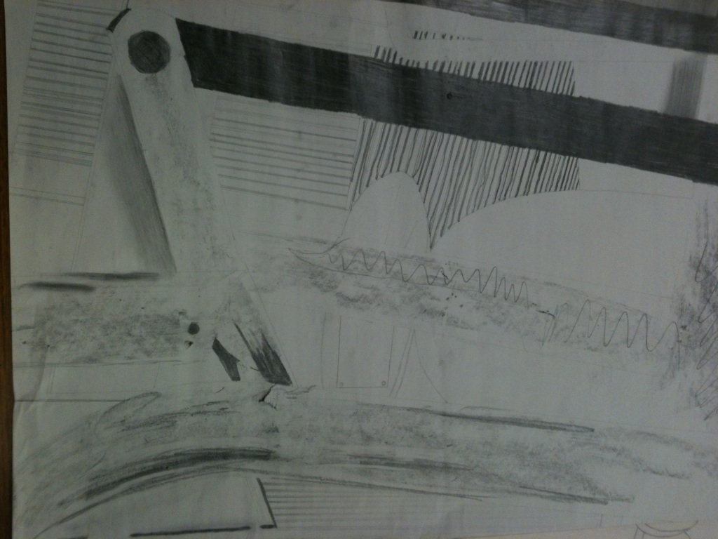
This first sketch was created because I found some cafeteria tables folded up and I laid under neither it to get all the metal bars in and the seats and the back ground. I must say it turned out pretty cool because the way the light came in it made these random white spots that add a lot of depth to my photo. Im trying to perfectly transfer the photo from my phone to a much larger surface (the paper) and not miss one single detail…this is very hard. The new thing I was introduced to was the graphite stick, it was quite easy to use minus the sounds it made which gave me goose bumps. With the graphite stick I would color in the dark spots and then turn it sideways the create the look of metal and then go back with an eraser to make the white highlights. I plan to improve this sketch by making the lines much cleaner and adding in the details I missed to the much larger piece of paper, also I will use charkel instead of the graphite stick so it will be much darker and more bold.
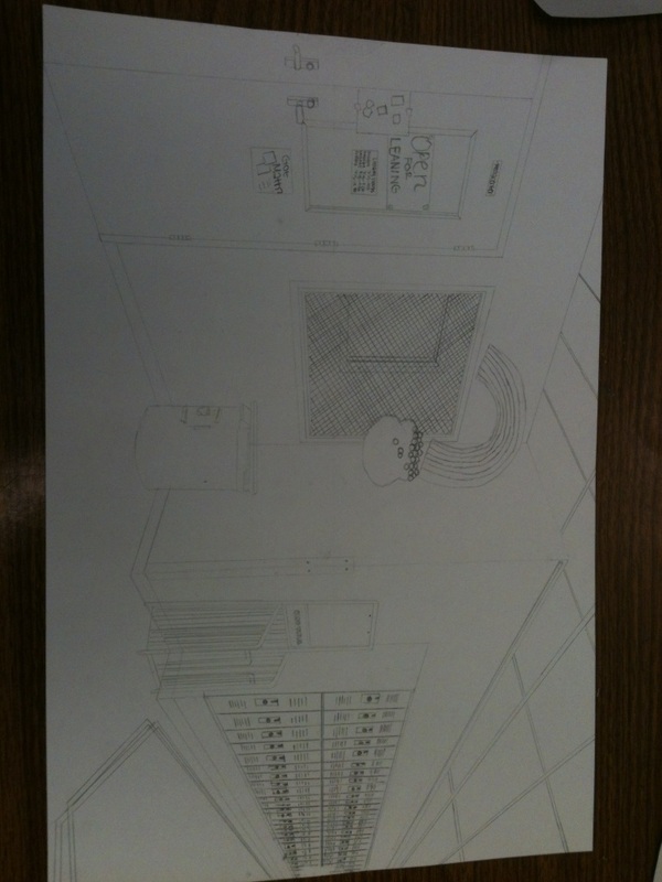
This assignment was to take a picture of a strange angle, or perspective of an object/objects. The way I took the project was to find something with many different parts and take a picture in a weird angle to create almost a new object because it was almost unable to identify what it is. The goals are to get a picture, get a medium size piece of paper and try to blow up the photo a lot and then outline that with a graphite stick and then move on to a gigantic piece of paper and blow up the picture even more! I am going to complete these goals by finding a very cool and confusing picture and then 2rawing it to my best ability.
The finished hallway completed the assignment by using two point perspective and adding details to make it look as real as possible. I know this is a successful design because it looks a lot like the corner and the details are almost perfect to real life. The lines are very smooth and clean and the little things I added in the drawing such as the rainbow. I was going to draw the entire mural but I ran out of time to do that so I only drew the rainbow with the pot of gold. To me this is a well completed drawing that represents two point perspective very well.
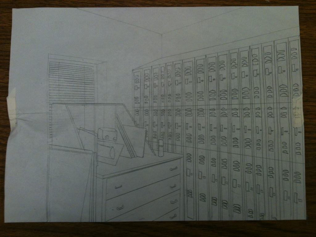
This second design is the corner in the classroom, it had a few of the lockers, a window and shelf with the drawing pads in it. The most difficulted part of this drawing was the window because there was so many things in front of
it but you could still see part of it si I just had to draw the window first and then slowly erase the parts of the window that where covered. This sketch is much better than my first because I have details and an actual corner to draw
not random shapes floating. I am going to improve upon this by going out in the hall and starting my rough draft and final.
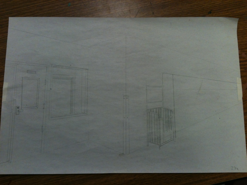
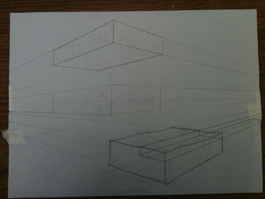
My first draft was pretty boring because all I was drawing was squares, one on the ground, one floating in the air and the other on the ceiling. This was to practice my skills and to get used to the two different points. The concept was very easy so grasp and understand because it had many similarities to one point perspective. I will grow on this by drawing a corner in the art room just to master this new art concept. The corner with be much more difficulted than floating squares because there will be many details and different angles that im not used to.
This assignment was second perspective, it was a lot like first perspective drawings but this time you have two vanishing points, thats where on either side of the paper about 3 to 4 inches away from the edge of the paper you place two dots, to draw from. The goals are to draw a corner in the hallway with this new concept, and I am going to accomplish this task by drawing the corner of the library. I chose this corner because it is very colorful with the mural on it and I liked the view of the window, doors and the lockers and I thought it would turn out cool.
The piece of art has accomplished the goals of the assignment by creating a piece of art with smaller shapes in it to create a bigger picture. This assignment was very creative because you didn’t have much direction to go on or much inspiration so you just had to think of a design that you couldn’t draw but create out of shapes and I think I did that very well in this project. This is successful because it is clean and defined and created with smaller shapes to create movement and shading. This project is done because I did what the requirements told me and pretreated them the way I thought of them, im not the best at just making up designs so im proud of this piece, because that’s exactly what I did, no pictures to go off of.
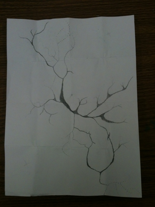
I have improved from last sketch by making it much cleaner lines and making the dots in the middle much darker and closer together to draw the eye in but not to the middle of the paper. I have also extended the larger more spread out circles more to make it look like its fading and I must say it looks cooler and more polished. This draft I think is much better than my first draft because the design is more clean and defined, and I actually know what im doing. I could improve this draft by making the circles maybe even darker to make it more bold and to add some little “crakes” or “sparkles” in the blank/white spaces because it is so bare and boring and I want to add something there to make it look complete.
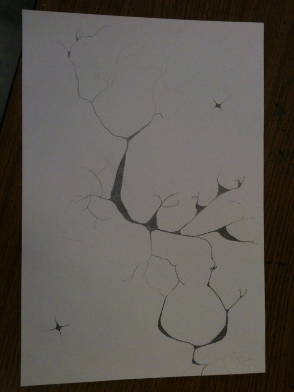
I came up with this sketch by just looking around the room and then my wrist started to itch and I looked at my wrist and saw my veins and the way they where shaped where really cool and different and I thought it would be a great design for my project. They curved and moved like nothing I had ever seen before so sense one of my veins looked cool I thought I would look at my other wrist to see I could find another cool design and just to my luck I did. I was at first trying to create the look of my veins but it ended up just looking like the desert so I decided to say that they where crakes in the ground. I plan to improve this rough draft by extending the circles out more to show and create
more of the “fading”. And I am going to make the circles in the middle smaller and a lot darker to draw the eye more to them.
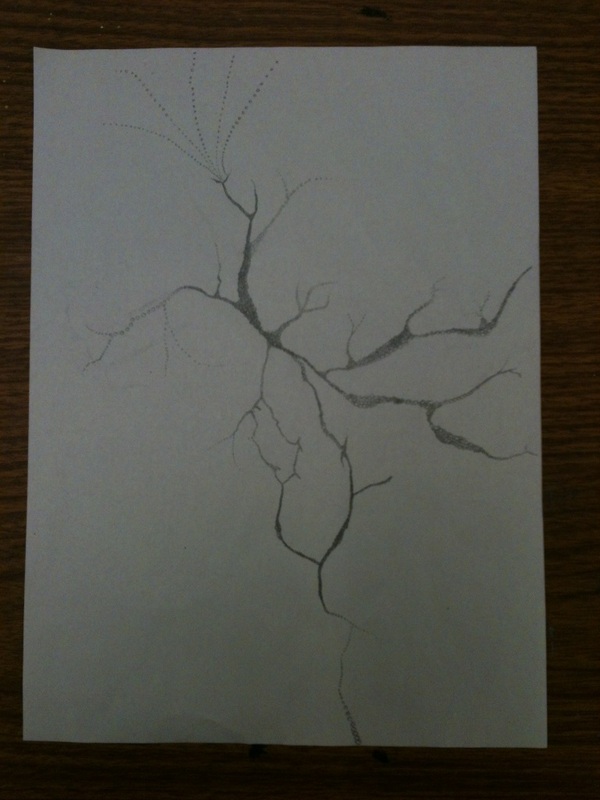
I came up with is first sketch by looking at my wrist and seeing my veins they looked so cool to me they were different. The shape looked like crakes, like in a desert because the land is so dry. The way the curved and moved gave me the idea to them with circles and that’s how I got my idea. Im going to try to accomplish this idea by drawing the thickest part of my vain with tinny little circles to create a very dark spot which will draw your eye right to it. Then the more lighter and less focused places I will draw larger and more spread out circles to create the look of openness. So it will look like its fading away this idea should look very cool, I think.
 RSS Feed