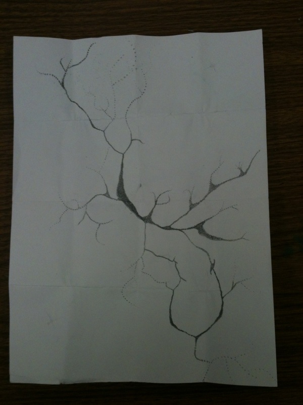
I have improved from last sketch by making it much cleaner lines and making the dots in the middle much darker and closer together to draw the eye in but not to the middle of the paper. I have also extended the larger more spread out circles more to make it look like its fading and I must say it looks cooler and more polished. This draft I think is much better than my first draft because the design is more clean and defined, and I actually know what im doing. I could improve this draft by making the circles maybe even darker to make it more bold and to add some little “crakes” or “sparkles” in the blank/white spaces because it is so bare and boring and I want to add something there to make it look complete.
 RSS Feed