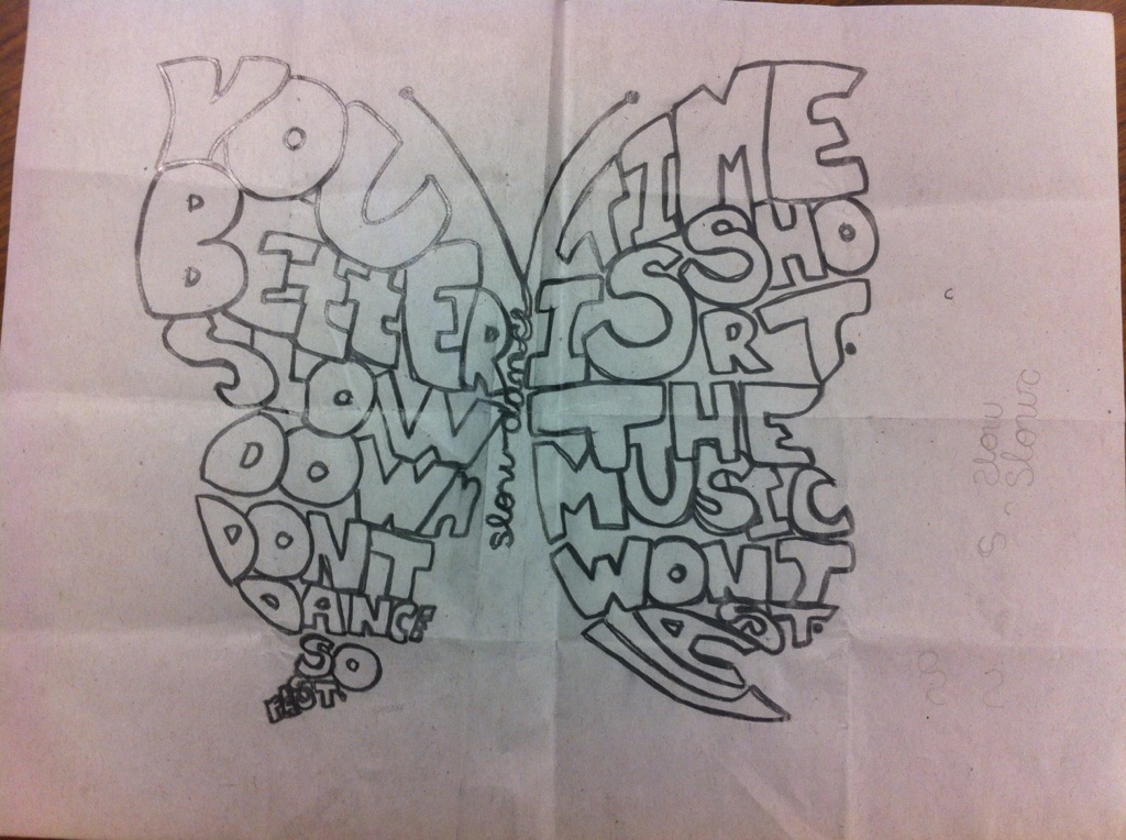
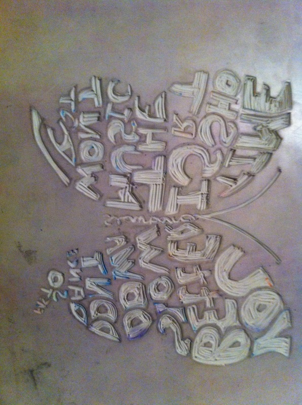
I made the words fit better in the shape of a butterfly, and i think it looks great, i really like how it is turning out. This new design is much different then the first but its less rough and more smooth lines and to me it is beautiful. I believe there isn't much to improve on this sketch except the middle of it because it is cursive and I'm not sure if it will show up very well in the printing process because the letters are so thin and small but i do not want to change it because i like the way it flows and looks.


 RSS Feed